

Far too many presenters pack their slides with far too much information: text, bullet points, graphs, data markers, data labels, and collections of images. This information-dump encourages the audience to read the slides and spend less time listening to you speak.
Graphs present a particular challenge for many presenters, especially those used to working with detailed data and numbers. In my experience, researchers and analysts tend to put all of their data on the screen, filling up graphs with lines and bars and packing tables full of numbers.
Even what seem to be the simplest graphs can give your audience difficulties discerning patterns or trends. Take this slide, for example. With only four lines, this graph doesn’t have so much information, but the different (ugh, Excel default!) colors and the crisscrossing patterns make it difficult to identify a single trend.
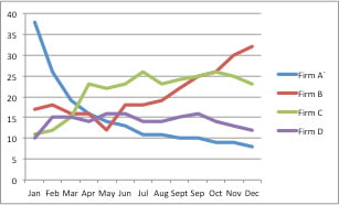
There are (at least) two strategies you can take to make this graph easier for your reader.
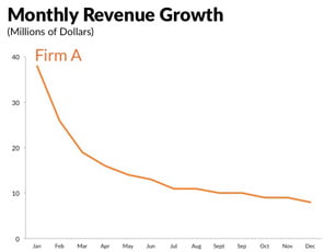
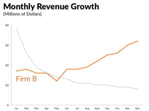
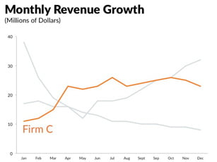
One strategy I often use is something I call “Layering.” Here, you present each data element sequentially, building up your story one data element at a time and walking your audience through your argument. The Layering technique can be applied to almost any slide object including images, graphs, and text.
In this example, instead of throwing the entire slide on the screen for the audience to decipher at one time, you can build up the graph one series at a time. (In some cases where the graph type may be non-standard or more complex, you may find it valuable to first show just the axes, describe what the graph is going to do, and then sequentially add the data.) Notice how in this case, the final graph has all four series, but you have brought the audience along with you to that final graph.
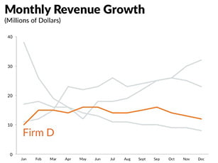
Another strategy is to take the “Small Multiples” approach. With small multiples, you create multiple, small versions of the graph. For presentations, you can also use small multiples with a layering approach, by sequentially adding each additional graph.
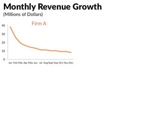
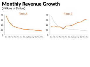
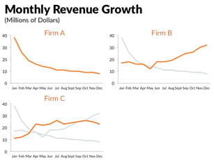
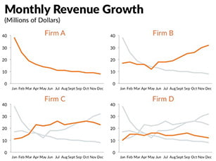
In either case, when using these approaches, be sure to make your last graph first and get everything arranged exactly the way you like. Then, when you start deleting the different data series, only the data values will change and not the axes or gridlines.
It’s especially important to lock the minimum and maximum values of the y-axis, because the software may change the axis values once you start deleting different data series.
When it comes to coloring the particular series of interest, the presenter needs to consider what is most important. Perhaps presenting every single line is not as important as focusing on a single data series. In that case, the Layering and Small Multiples approaches may not be entirely necessary and instead a single graph is best. I find that I begin building your graphs in the same color—gray works great—and then purposefully add color to help support the written or spoken word.
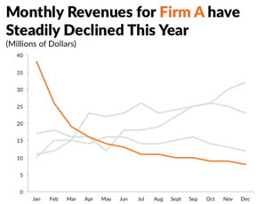
In the end, presentations are a fundamentally different form of communication than what you might write down and publish in a journal, report, or blog post. Simply copying and pasting portions of text, tables, and graphs disrupts how the speaker communicates information.
Instead, consider how you can visualize your content, unify what you say and what you show, and focus your audience’s attention where you want it when you want it.
These, and other important lessons about designing, creating, and delivering presentations can be found in my forthcoming book, Better Presentations: A Guide for Scholars, Researchers, and Wonks.
Jon Schwabish is an economist, writer, teacher, and creator of policy-relevant data visualizations. He is considered a leading voice for clarity and accessibility in how researchers communicate their findings. His new book about presentation design and techniques, Better Presentations: A Guide for Scholars, Researchers, and Wonks is available now.